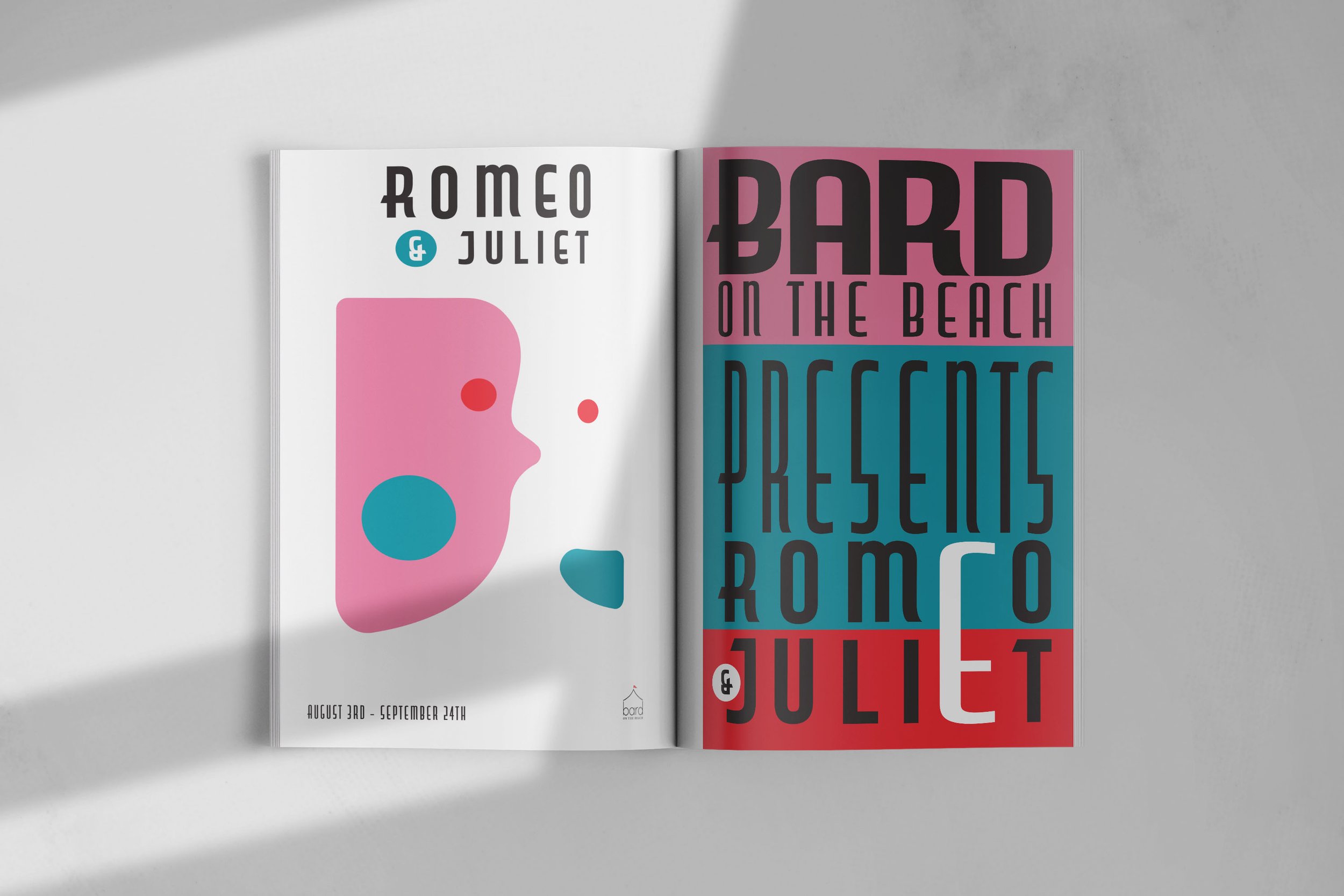
ROMEO AND JULIET
These designs were approached with the emphasis on colour as the connection. A bright and abstract pop-art visual attract young consumers. This youthful approach connects a twenty-first-century audience with an ancient play and allows viewers to visualize their own story within Shakespeare. The typography bridges contemporary font with a manuscript feel which preserves the pure connection of an older consumer with the layout. The combination of font and colour creates a fluid dialogue between posters in a way that highlights its youthful intentions while preserving the tradition of Shakespearean theatre.

